button in the side toolbar.
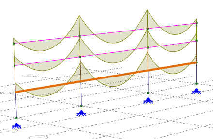
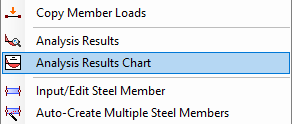
You can display a chart for an analysis member, plate strip or steel member by turning on an analysis result diagram and then double-clicking on any part of the diagram. Alternatively, you can display a chart for multiple members by selecting them, right-clicking and choosing "Analysis Results Chart" from the popup menu that appears.
Note that double-clicking to get a chart for an entire steel member made from multiple analysis members will only work if you have switched into steel member viewing mode by clicking the button in the side toolbar.
 |
 |
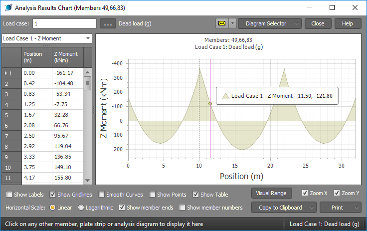
Load case selection
You can type in a load case number or a list of load cases and then press Enter to see the updated chart.
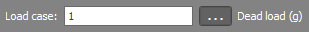
Alternatively, you can click the  button to display a list of load cases that you can select from.
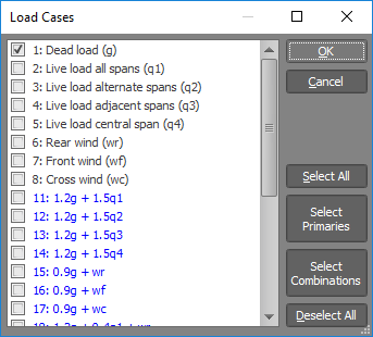
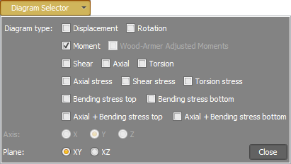
Diagram selection
You can change the diagram type or show multiple diagrams by clicking the "Diagram Selector" button and then making the desired selections. Note that moments adjusted according to the Wood-Armer method can be obtained for reinforced concrete plate strips by selecting the "Wood-Armer Adjusted Moments" option. For more information on the Wood-Armer method refer to "Sign Conventions".
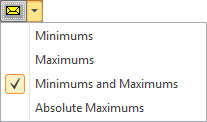
If multiple load cases are selected you can update the chart to show an envelope of minimums, maximums or absolute maximums.
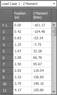
Data table
The data table shows the tabulated values for the displayed chart. If you have multiple load cases selected then the selection box at the top of the table lets you choose which load case to tabulate. You can hide the data table by unticking the "Show Table" option at the bottom.
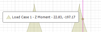
Querying
As you move your mouse over the chart the underlying value is displayed in a information box.
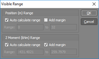
Visual range
Diagrams are automatically scaled to show the full range of values available, however you can examine part of a diagram more closely by selecting "Zoom X" and/or "Zoom Y" and then using the mouse scrollwheel to zoom in/out or drag with the left mouse button to pan the diagram. Alternatively, you can click the "Visual Range" button and then set the range of values you are interested in.
Other options
The options at the bottom of the chart allow you to turn on various items and labels. The "Smooth Curves" option draws a Bezier curve between the data points instead of straight line segments.